
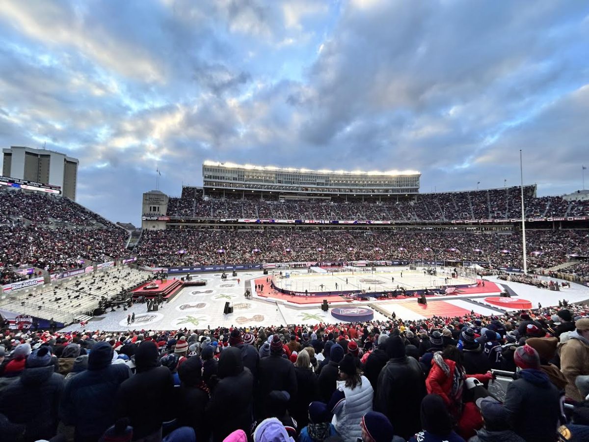
Every year, crowds of hockey fans gather to watch an exhilarating game in either a football or baseball stadium. Known as the NHL Stadium Series, the event features National Hockey League (NHL) teams competing outdoors, providing a unique setting for the game. Since its debut in 2014, the Stadium Series has transformed outdoor hockey into a thrilling performance, with dramatic player introductions and high-stakes competition. However, what truly steals the spotlight is the jerseys. Each game features innovative, experimental designs that intrigue fans and spark conversation, making the unique jerseys the standout element. Here are the Top 10 NHL Stadium Series jerseys of all time.
#10 San Jose Sharks (2015)
At number 10, the Sharks’ 2015 jersey emphasizes color balance. Using orange as a thin collar accent rather than a main component prevents the team’s primary teal color from feeling flat. Furthermore, it creates a high-contrast frame for the player’s face, making the teal and black striping on the sleeves feel heavier and more aggressive.
#9 Colorado Avalanche (2016)
Colorado’s 2016 jersey exemplifies state pride by replacing the mountain logo with the “C” from the Colorado flag to create a minimalist look. The use of silvery gray between the deep burgundy and navy blue keeps the jersey from looking too dark under stadium lights, giving it a sharp edge.
#8 Toronto Maple Leafs (2018)
The Leafs’ 2018 jerseys’ strength is negative space. Going almost entirely white with bold blue horizontal stripes creates a clean look on the ice. Similar to the Avalanche, the minimalist approach of relying on the purity of the blue makes the classic maple leaf logo pop without any clutter.
#7 Pittsburgh Penguins (2019)
Pittsburgh’s jersey ranks seventh due to the key addition of triangular symmetry. Placing the logo inside the bold yellow triangle draws the eye inward. Moving the penguin logo to the helmet was a great decision to showcase additional team spirit.
#6 Washington Capitals (2023)
The Capitals’ 2023 jersey is ranked sixth because it features a seam-to-seam version of the beloved “Weagle” logo as the main crest. Inspired by the team’s original uniform from 1974, the sleeves include red, white and blue stripes. The jersey has number stickers, a large capital logo on the helmet and stars running down the sides of the pants, creating an attractive and appealing look.
#5 Tampa Bay Lightning (2022)
Tampa Bay’s jersey succeeds because it’s disruptive. Most hockey jerseys use straight lines, but Tampa’s jagged, lightning bolts promote a fresh, distinct feel. The oversized “BOLTS” font and the royal blue on the cuffs create a sense of vibrating energy, perfectly capturing the franchise’s identity.
#4 Nashville Predators (2022)
The Nashville “Smashville” jersey ranks fourth due to its bold choices and commitment to using the city as its muse. The use of bright gold ensured visibility in the stadium and the musical elements added a local touch.
#3 New York Rangers (2024)
The Rangers’ 2024 jersey makes it into the top three because of its streetwear feel, ditching the full “Rangers” text for the “NYR” abbreviation. The diagonal orientation maintains the team’s heritage, while the sleeve stripes provide a heavy visual weight that looks stunning on an outdoor stadium rink.
#2 Detroit Red Wings (2016)
Detroit ranks second due to its careful design. The jersey features a modern take on the Red Wings’ alternate “D” logo. With a vibrant red as the main color and a striking diagonal white stripe, this jersey truly makes a statement.
#1 Los Angeles Kings (2020)
The Los Angeles Kings’ 2020 jersey takes the top spot as the contrast between black, white and silver was highly visible under stadium lights. Even from afar, the angled “LA” logo adds a sense of motion. The addition of a silver chrome helmet makes the overall look feel intentional and bold while seeming timeless, as it remains well-regarded.