
A Lukewarm Perspective: Color
Photo illustration by Luke Jordan
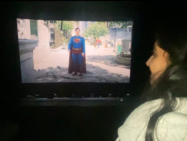
Senior Luke Jordan looks up at the sky, seeing a rainbow full of color.
Color: like flavor for the eyes. Whether you’re into the excitement and thrill of hot pink or the dull lifelessness of beige, color has something for everyone. Not all colors are created equal, however. If you’re having trouble with interior design or merely picking a favorite, I’m here to help.
Red
An icon of the color world, red acts as the ringleader. There’s a reason ROYGBIV is always in that order. Seen as a symbol of power and courage across the globe, approximately 75% of all national flags feature the color. That isn’t a surprise to me. If you’re trying to stand out or make a statement, red is the color for you.
Orange
Though its namesake fruit is highly regarded, the same cannot be said about the color. It hurts my eyes to look at. It can’t make up its mind. It wants to be red and yellow so bad, yet pales in comparison to both. One such orange item is the traffic cone. Its design, so ingeniously grotesque, discourages drivers from running it over simply by how ugly it is. While I’m not sure this was intentional or factual, it makes perfect sense.
Yellow
After years of experience, I’ve come to learn that yellow lettering on a white background is hard to read. Shocking, I know, but don’t let that stop you from using it. Yellow is great for complementing other colors. If you think of a color and put it with yellow, chances are it’ll make for a good color scheme. By itself it’s alright, but it really shines when it’s got a buddy.
Green
The only correct answer to the question “what color should I make my biology folder?”, green can be found everywhere from the grass on the ground to the dollar bills we so desperately crave. Vegetables, a highly hit-or-miss food group, are overwhelmingly dominated by the color. I see this as a positive, but I can see how this could be a turn-off. While not my favorite, I see the appeal in green, and it’s not just because I’m Irish. With that being said, neon green is hideous.
Blue
A cool color, both literally and in my opinion, blue radiates a unique energy unfamiliar to the rest of the rainbow. It ranges from the retro stylings of teal to the modern, neutral navy. It can have its spotlight moments, but can also fade into the background when need be. Though pretty common in the world around us whether in the sky or at sea, this is without a doubt my favorite.
Purple
Known for being Harold’s crayon of choice, purple is blue’s less popular counterpart. What blue lacks in warmth, purple makes up for in bold vibrance. Though traditionally seen as a feminine color, purple is far more than just “for girls.” Unfairly underutilized in the men’s clothing department, purple is underrated in my eyes. If you don’t believe me, just ask the Acatonics.
Your donation will support the student journalists of Thomas S. Wootton High School. Your contribution will allow us to purchase equipment and cover our annual website hosting costs.
Luke Jordan is a 2022 graduate.


![Freshmen Kuyper Birdsall and Josh Downie sit in the media center during third period. Downie carries books he's planning to check out about Gandhi, who is the focus of 1982's Best Picture, Richard Attenborough's passion project, "Gandhi." Birdsall looks up 1983's Best Picture, "Terms of Endearment," which is James L. Brooks debut feature, on the media center computer. "I think the award [for Best Picture] gives attention to good movies, and that's important, especially for debut directors like [James L. Brooks]," Downie said.](https://woottoncommonsense.com/wp-content/uploads/2026/05/Shp6tl5ZPy3hIelqhe7CkSB77DnfJIOHoBhMehib-600x450.jpg)